Hot Color Trends For 2014
How can one stay on trend with current colors in home decor and interior design?
Many interior design and home decorating magazines that are available on the newsstands as well as professional trade magazines that we, as interior designers, see come across our desks will have articles predicting color trends.
Gray Is The New Black
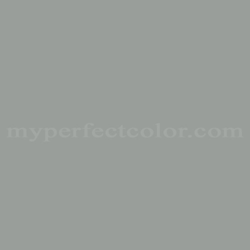
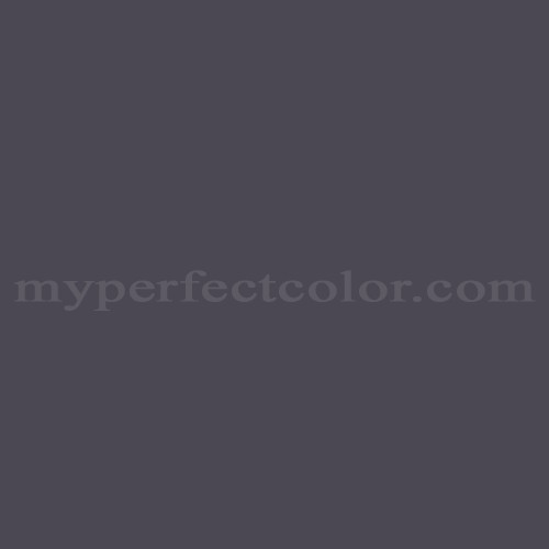
Sherwin-Williams, the paint company, comes up with several 'hot color' palettes each year. For 2014, the palettes are either very subdued and calming or very graphic and vibrant. Kim Palmer, the editor of STIR, Sherwin-Williams trade magazine about 'everything color' says gray is the new black, which she refers to as a cool neutral. She suggests mixing gray with the more vibrant color palettes the company has put together. Sherwn-Williams has chosen Classic French Gray (shown), Agreeable Gray, Crushed Ice, Gauntlet Gray, Earl Gray (shown) and Peppercorn (shown) as the grays that will be popular in 2014.
Vibrant Colors Are Hot, Too
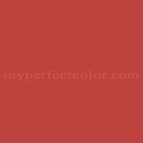
The more vibrant colors in some of the other palettes are gold (Ceremonial Gold), pink (Dynamo), orange (Ablaze, shown, and Raucous Orange), kelly green (Houseplant, shown) and teal (Capri and Georgian Bay). Another of the palettes has more organic and earthy colors in it, in shades of plum (Quixotic Plum, shown, Exclusive Plum and Enigma), bronze (Relic Bronze), pewter (Library Pewter, Anew Gray) and brown tones (Antiquarian Brown).
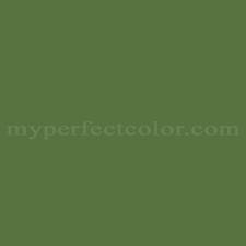
Think of Freshwater Pearls
The last palette in the Sherwin-Williams forecast has colors that are light, delicate and translucent--think of the color of freshwater pearls. Colors in this palette are Spun Sugar (shown), Malted Milk (shown), Steamed Milk, Westhighland White and Fleur de Sel (shown).


On the other hand, paint company Benjamin Moore, has announced the most highly anticipated color of the year will be Breath of Fresh Air, shown, an ethereal blue shade. It has been cited as a new neutral and has been included in a palette of 23 pastel and deeper colors. The colors include Distant Gray, White Dove, (shown), Coral Essence, (shown), Lavender Mist and Black Satin, along with shades of blue and teal. Doty Horn, director of color and design at Benjamin Moore also cites the growing popularity of copper patina to be used as an accent color.
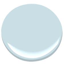
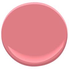
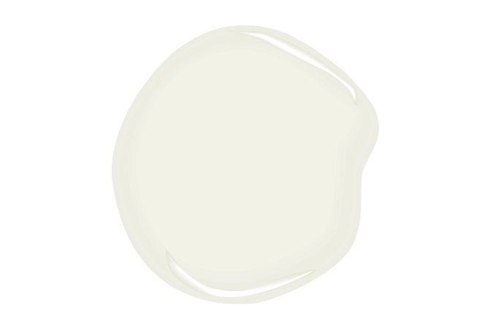
More Blue and Orange Tones
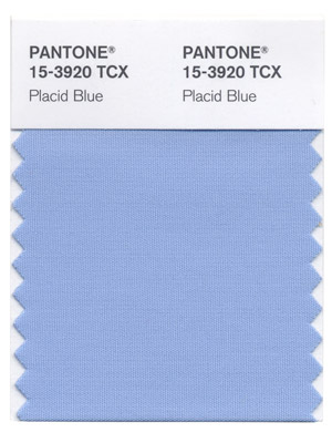
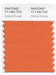
Pantone, a world-renowned authority of color, has picked Placid Blue, shown, as its 'color of the year'. Other popular choices are Violet Tulip, Hemlock, Cayenne (shown), Fressia, Celosia Orange (shown), Radiant Orchid and Dazzling Blue. The art directors at Pantone recommend using these colors with pastels.
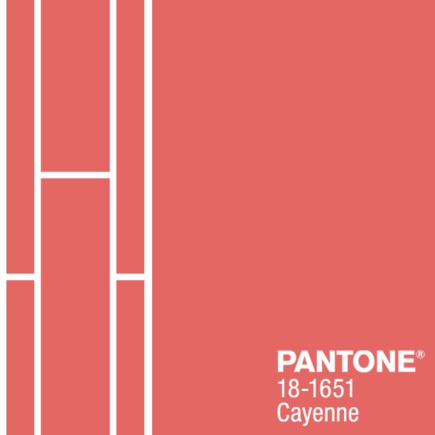
Lastly, Stacy Garcia, a chair holder of the Color Marketing Group, an international color forecasting association, has picked the tones of walnut, cayenne and true blue as 2014's hottest colors. She recommends mixing walnut tones with caramel and camel tones and mixing cayenne with sand or oatmeal tones. Textures always add interest to a room, so she recommends layers of analogous colors (same color--different hues), especially when using bright colors like the true blue, which is more of a cobalt color.
Color Choices Are Personal
Do you notice some similarities in the color forecasts? If you have lived with dark paint and upholstery and are craving just a hint of color on your walls or your main pieces of furniture, use the lighter tones to 'freshen' up your home. Use the darker, more vibrant palettes for side tables, pillows, artwork and accessories---pieces that you can replace more frequently when you feel the urge for an update but don't want to re-do all of the pieces you already own.
One of the most important things to remember about picking color for your home is that it is something you have to feel comfortable living with day after day. If you can't see yourself living with a violet or an orange sofa, use it for throw pillows or accessories and put one of the neutrals on the walls or larger pieces of furniture. If you can't see living with blue walls but love blue consider using it on a sofa or chair. Also, when shopping for furniture remember that colors do come and go in popularity. Reds have turned into those with more orange undertones in the recent past and it is now easier to find fabrics with red orange tones than with a true red tone. If you love hunter green be prepared to change to another color of green as a second choice as yellow greens and teals are more popular right now.
Contact us or call one of our designers at 608-785-2124 for more information with style, design or ordering questions.
